6 Beautiful Therapist Websites on Squarespace for Inspiration
Here at Bold August, we don’t necessarily niche in therapy website design, but we sure do a lot of designs for therapists! This is mostly all thanks to a particular client of mine - Avalon Psychotherapy - who I worked with many years ago. I wrote a case study about her site, and then she told her group of therapy friends about me, and then they told their friends…and the rest is history. This has given me about 10 years of website experienced that is largely niched to therapy websites.
So while I don’t 100% niche in therapist websites for Squarespace, I know a heck of a lot about them. In fact, this whole article is specifically to showcase 6 different therapy brands and websites that Bold August has designed! (If you’re one of my therapist clients and you aren’t on this list, please don’t worry - I tried to show a range of styles and types! I think all of my therapy websites are beautiful!)
Nobody pay attention to how dirty my screen is, okay? But those are my hands: I clearly have a future as a hand model.
Why do I use Squarespace to build beautiful therapy / counselor brands and websites?
Squarespace is currently the best website builder on the market for therapists. There, I said it. No other platform gives you the combination of ease of use, a beautiful user interface, and so much flexibility. The platform is just the easiest and most user-friendly way to create websites currently. I also say that as a designer who LOVES trying out new platforms (I’m not joking, a new platform to me is like candy. I love trying out new flavors and seeing what sticks the best.)
With Squarespace, you can use one of their starter templates or you can build your own completely from scratch. (Or, you know, hire a website designer like me!) They make it incredibly easy to get started with tons of pre-set designs.
I use Squarespace because it’s flexible for my user and also allows me to create absolutely stunning designs. That’s really a tough order: a web builder that’s good for clients AND is good for designers? Squarespace somehow has nailed it. And, I’ve been using the platform for 10+ years, meaning I’ve first-hand seen how the platform has committed to change and keeping their user interface beautiful and relevant to new business owners.
Not only that, but Squarespace is a popular platform which means it also has tons and tons of resources, tutorials, and how-to articles out there. If you can’t figure out how to do something, the answer is almost always just a Google away for you. Lesser-known platforms can’t boast that level of education quite yet. I myself have an entire Squarespace video library with tips and tutorials about how to do specific things in the platform for small business owners.
How to set up a Therapist Website on Squarespace
I always say to start with content and goals first. The best Squarespace website often starts with a Google Doc. Head to a blank document and start writing, and you’ll be doing huge foundational work for your therapist website. Websites are a structure that need content and design to make them specific to an audience and demonstrate your business’s personality. You’re going to have to write anyway, so you might as well start with that first.
I’d start writing the below to form the basis of your Squarespace website:
Your therapist bio. Write a short, one-paragraph bio and then a longer, in-depth bio. The shorter one is perfect for a snippet about you on your homepage
Your services. What are you specifically going to specialize in? EMDR? Couples therapy? Play therapy? Write out each service, modality, and specialty and describe your approach in great detail.
Contact information. How do I get in contact with you? What information are you going to display? Is your office fully virtual, or not? Write out these instructions like you’re explaining to a five year old. You need to make sure that for someone in crisis or who needs a therapist, you are giving them easy instructions and not leaving anything out.
Your insurance / billing / and FAQs. Start answering those now, and in great detail. People read FAQ pages for therapy practice websites pretty heavily. Write out all of these things!
What makes you unique? Last but not least, how are you going to stand out in a sea of other therapists? Do you work with the polyvagal theory? Are you specific to a demographic? Do you work exclusively with women, men, couples, veterans, etc? Start writing all your unique viewpoints.
After you’ve finished writing, you have to make a choice. Do you want to hire a designer like me to put it all together for you, or are you going to start with a template?
If you have a brand, you could probably put it together yourself if you were absolutely tight on a budget. Please consider that an average website takes me, a professional, about 40 hours to fully complete top to bottom! Using a template can absolutely help, but every template is also a blank slate that needs your images, branding, and content to fill it in.
Or, you might work with a professional to build it all. You’ll then decide what your budget is, what your needs are, and what’s important to you: and then begin to research designers that meet that criteria. I pride myself on being a designer who focuses on accessibility for the user, flexibility for the owner, and a fun process that feels rich with business coaching as well as design. I hold the hands of all my therapists who work with me so that I can guide you through what it’s like having a business online! Plus, I record custom how-to videos on how to edit your website.
How can I make my therapy website look as unique as your designs?
Branding. Branding. Branding. Websites are structures, like houses, that need the “interior design” to bring them all together and make them stand out. Wallpaper. Paint color. Fixtures. You need brand visuals to make your therapy website stand apart. This is why brand design is absolutely a crucial step and why I don’t do websites without branding first!
You need to consider also how your copy and content completely stand out as well. Your website is going to be as unique as you make it! What makes you different? What is a philosophy that you stand for? What unique qualifications do you have? Content is just as crucial as design to help your therapist website standout from all of the other therapist websites.
This is why tons of my therapy clients come to me and want to use me as a designer: I specialize in creating beautiful brands that will look uniquely you and bring out your business’s personality.
What should I be looking for in therapist website examples?
You might think you want to be looking for branding and cool animations and designs, but truthfully, the main thing you should look at is if the website is user-friendly. After all, these websites are intended to get therapy clients. The #1 goal of a therapist website is typically to either get leads or get more qualified leads. If the website is beautiful but not functional, it might belong in a gallery, but it might not actually convert.
You should be looking to see if the examples have personality. Originality. Expertise. And, of course, they should also look and feel unique and beautiful as well. I absolutely don’t want to discount beautiful branding, but branding should function to showcase the individual personality of the business, not just to only “look pretty.”
Beautiful Examples of Therapist Website Design from Bold August
Smyrna Couples Counseling - a saturated and beautiful brand & website design that focuses on couples counseling exclusively.
This brand was so fun to design and the website was even more fun! The earthy tones and darker colors allowed for a more serious and deep vibe that really felt grounded and trustworthy. I absolutely loved working with Jena to bring her vision to life. She wanted to focus on a gold metallic texture throughout her site, which is called kintsugi, or the Japanese art of repairing pottery with gold leaf to make them beautifully broken. Jena is also the 1st Certified Black Female Emotionally Focused COUPLES Therapist (EFCT) in GA! I was absolutely honored to be her brand and website designer.
Healing Room Counseling - talk about a bold, colorful, and fun therapist website design!
Sarah Meng from Healing Room Counseling wanted a colorful therapy website to showcase her bright personality and also represent her work with queer, LGTBQIA+ audience. Her brand ended up being very personal to her, and was custom-illustrated with a lantern which also happened to be something she had tattooed. By including personal references to clients in branding, the businesses feel powerful and unique.
Get EMPWRD - a beautiful, neutral brand that brilliant showcases calm and peaceful aesthetic.
April was a client who trusted Bold August with her neutral, traditional brand styling despite my colorful brand and portfolio. Her brand is a beautiful, subtle masterpiece that has elegant brand touches throughout. We focused on natural textures, shadows, and a high-end look to cater to her high-performing female audience. This therapist website is
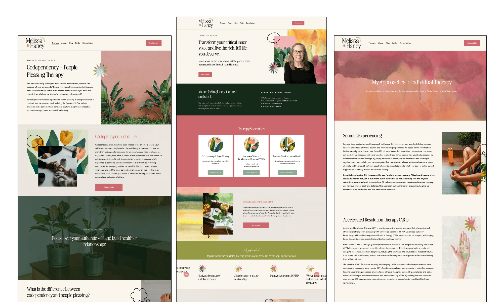
Melissa Haney - personality-driven therapist Squarespace design.
Melissa came to me wanting a site that better reflected who she was and what she was all about! Her existing website was actually done professionally and was pretty good, but she didn’t feel it best represented her mission or values. We reworked her logo and her website to completely reflect her style. Her Austin, TX flair but cheerful personality are completely represented throughout her website! She wrote fresh copy with my SEO guidance as well, so it’s completely redone top to bottom.
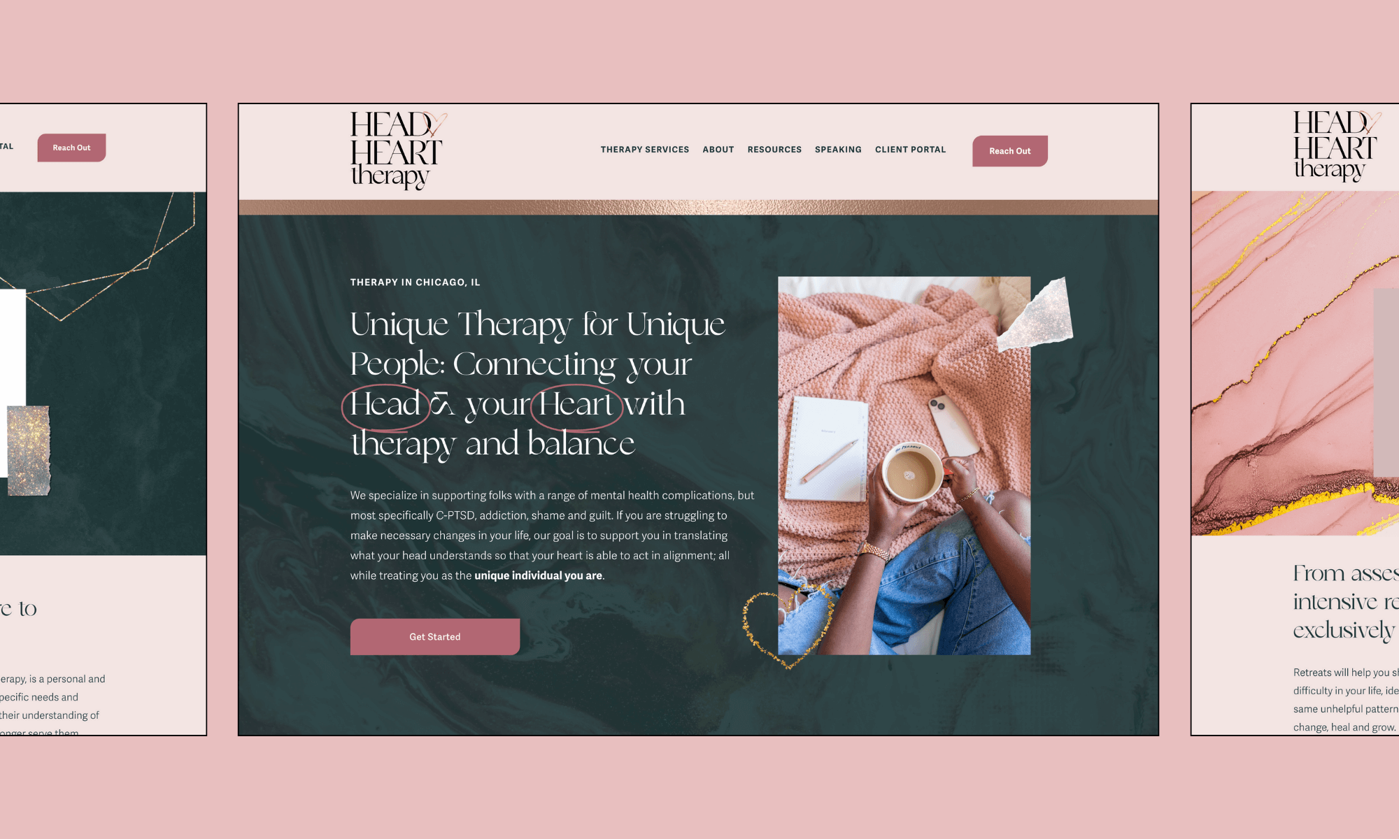
Head Heart Therapy - talk about BEAUTIFUL brand representation in design!
Head Heart Therapy was a personal, luxurious favorite. Her website is top to bottom unique and custom and features sparkly, metallic assets, a diverse color palette, and her entire team bios are well represented. Rayell (the owner) has been keeping in touch with Bold August and we absolutely love watching their growth. This brand is stunning and was perfectly aligned with their growth.
Whole Brain Institute - An educational website that teaches other therapists with a scholarly feel.
Whole Brain came to me needing an institute-esque brand that felt like a badge or a school’s crest. We delivered with a special brand design that had nods to each of the co-owners’ personalities. The entire website is a robust resource for other therapists to learn and get CEUs. We love the specific, academic feel: almost like you’re in a fancy library browsing the books in antiquities or the historical references. This website shows that a darker website can still feel accessible and beautiful.
In conclusion, therapist websites come in so many different styles and designs.
Design and branding form the basis of all of these websites. They’re all well organized and complete representations of their owners, and most importantly, they function well for the folks that need to benefit from them! Anyone visiting any of these counseling websites will have no problem finding the information they need and getting connected to a therapist that they need.
If you’re ready to uplevel your brand and website so that your website can join this list, please reach out today. We’d absolutely love to build your brand and create a beautiful therapist website in Squarespace for your practice!


