Behind the Scenes of My Brand Profile Quiz: The Design Decoder, and Why Brand Profiles Matter
Haven’t taken the quiz yet? Take My Brand Profile Quiz Here!
This article describes all the profiles in my brand quiz, The Design Decoder. Take the quiz to learn all about your brand style!
There are about a half million brand profile quizzes out there, what makes mine so special?
The “Design Decoder” is more than a brand quiz: it’s a vocabulary builder intended to help you identify the brand elements you like, so you can tell your designer! I called my brand profile quiz a “decoder” because it reminded me of those old school decoder rings and a puzzle to be solved.
Puzzles are fun, they’re tricky, but they have solutions. Through deciphering a puzzle, you come to the end with more clarity and had some fun discovering yourself along the way! Plus, with every step of a puzzle and every phase through deciphering yourself, you learn something new about your brand style and your business personality.
There’s so much involved with branding: it goes beyond a logo. You’ll notice there are NO logo questions in the quiz at all: it completely focuses on brand assets like textures, patterns, stock photography, mockups, and overall vibe.
A Brand is the Sum of All its Parts: A Brand Profile Helps Sort That
Think of branding like a math equation, but a fun one, not like the horrible ones from high school: fonts + colors + brand assets + tone = your brand. Or maybe a more fun anatomy is a potion or a brew!
So often clients think they just need a “logo” because it’s what we see when we start to do that research. But truly, a logo is not at all the main component of a brand. In fact, any instagram you feed will mostly likely feature that brand’s fonts, colors, and visuals more than their logo. And on a website, typically once you start scrolling down, the logo disappears and then you get to focus on the branding and, of course, the visuals.
A Brand Profile Helps to Guide Your Unique Vision
This year I got a lot of “I don’t really know how to describe what I want…” statements from my small business clients, specifically my therapy brands. When you’re used to your own industry of therapy or finances or even dog training, you’re not really thinking about the phrase “texture” or “business card mockup.”
By creating these brand profiles, I hope to equip my potential clients with vocabulary and design descriptions so that it’s easier to tell me what they’re looking for. Having a starting Pinterest board also makes it easy to get going with pinning your own brand vision, and then you have keywords you can use to search further!
Behind My Brand Profile Quiz Results: An Explanation of My Brand Asset Profile Chart
This is a concept created by me, Olivia of Bold August, and is not an “official” brand chart. I find that having this helps me to understand my clients a bit more so I can think outside of my own box.
Quantity of Elements
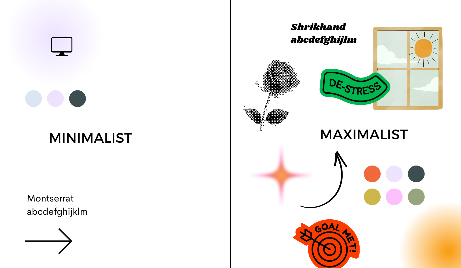
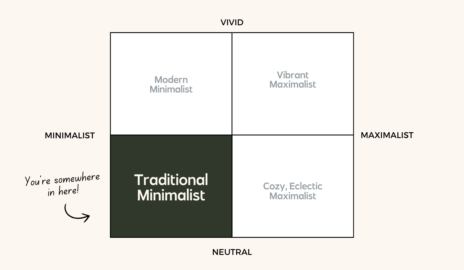
The X-Axis represents the amount of brand elements and the type of brand elements. Brand elements are things like textures, stock photography, patterns, graphics, elements, and icons to name a few. Some clients love a LOT of these things, and some are more minimalist. That’s why my two end points are minimalist and maximalist.
If you have a minimal brand, you’re most likely someone that likes clean lines, not a lot of fuss, organized vibes, and a more modern style.
If you have a maximalist style, you like STUFF. You want the patterns and the fun fonts and the textures and more colors and more more more! You want to layer it all on like the craziest cake anyone’s ever seen.
I want to clarify something though:
Minimalistic does not mean boring, and Maximalist does not mean chaotic. You can be a minimal brand and have bright, fun, neon colors and still use them simply. You can also be a maximalist and like muted colors and cozier vibes.
Color and Profile
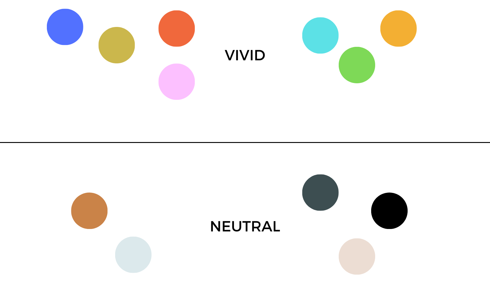
That’s Why the Y-Axis is my color and vibe axis. If your vibe is vibrant, you DO like those bold colors, bright colors, energetic tone of voice, and high spirited writing. My Vibrant folks have a pop of color or a statement font.
My neutral folks prefer a calmer vibe. Their tone is cool as a cucumber and they like things a bit more grounded. They might still have a lot of colors (if they’re also closer to maximalist) but the colors are maybe subtler and muted. The visuals will feel relaxed and calm vs high energy and vivid.
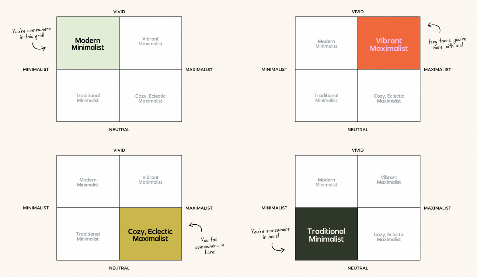
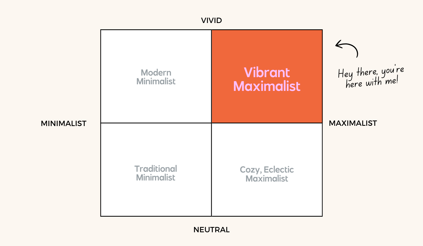
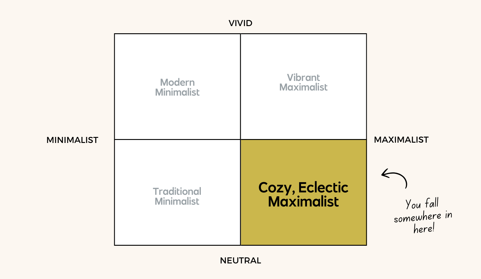
By combining vibrant, neutral, maximalist, and minimalist, you get four quadrants that can help guide brand decisions!
And of course not everyone is going to fit squarely on the line! I can think of many of my brands that straddle two styles or even are close to the center, truly using a mixture of all elements. By having focus in your brand profile, however, you can make decisions that stick to the heart of who you are.
Modern Minimalist Brand Profile
How can you be a minimalist but still enjoy a bold color? By focusing on clean lines, breathing room, and pops of color or style for emphasis. This personality loves a crisp border or a clear point of view. They are up the Y Axis in color palette because while they’re minimal, they’re strong and typically have a bold color choice, font choice, or visual choice.
I love the word “modern” here instead of vibrant because modern design is typically defined by boldness. When you type “modern design style” you’ll typically get articles of helvetica, bauhuas design, art deco, or interior design styles with simplistic shapes. What all these things have in common is focus and a real point of view.
Traditional Minimalist Brand Profile
Here, instead of using my “Neutral” phrase from my brand matrix, I’m using “Traditional.” A traditional design style is defined by the “old school” type: serif fonts, nods to an older typeset style, beautiful shadows and depth of visual that feels akin to traditional interior design styles. Traditional stylings almost always conjure visions of serif fonts and high end magazine covers, elements that feel timeless.
Timeless is the perfect word for this brand, but there’s also a reason it’s completely opposite from the Vibrant Maximalist: they also like simple. There’s elegance in simplicity, a nice focus and tons of breathing room.
Vibrant Maximalist Brand Profile
Welcome to my corner of the brand world! If you haven’t noticed, Bold August is most decidedly a vibrant and maximal brand. I love a fun set of textures, I change my mind on color palettes almost all the time, and the more fonts the merrier. I’m a huge fan of throwing spaghetti at the wall and it’s preferred if that spaghetti is brightly colored and FUN. My brand can sometimes feel scrapbook-esque but it’s always lovingly chaotic.
This brand eats bold colors for breakfast, absolutely wants a bazillion brand patterns (and is already probably trying to make a few of them work), and has probably also tried multiple fonts with their branding as well. They thrive on energy!
Originally I had the word “chaotic” all over my brand quiz, but so many were turned off by the word, but it’s one I embrace. You can absolutely have an organized chaos. Chaos is all about growth and changing and moving and shaping and being a bit messy in the process.
Cozy, Eclectic Maximalist Brand Profile
The only profile I just had to title with three words because they’re my oddballs. (I say that lovingly!) This is the brand that sometimes feels like they’re “very hard to describe.” They never really fit in because they haven’t been able to explain who they are until this point (I hope this quiz is giving you some clarity!)
This brand profile often gets mixed in with the vibrant maximalists, which probably stresses them out, or the traditionalists which makes them feel bored and stuck. You see, my cozy, eclectic maximalist also loves the STUFF that comes with a brand but they love it in a calm way. They have all the calm vibes of a Modern Minimalist but all the textures, patterns, and much-ness of a vibrant maximalist. They’re grounded, dug into the earth, and have fonts and colors that make them feel at peace but also surrounded by things they love. If the vibrant maximalist is a phoenix or a peacock, the eclectic maximalist is a dragon hoarding their favorite treasures or a raven.
What if you don’t agree with your brand profile quiz result?
There’s definitely a few reasons you might be looking at your brand profile and scratching your head. I’ll break them down below, but I’ll also say that this isn’t prescriptive. This quiz was ultimately a way to break down vocabulary for my user so they can be descriptive. What texture makes you happy? What font makes your heart sing? What color palette vibe? Once you can nail down WHY you like what you like, your designer can get closer to identifying your brand style for you.
why you might not be feel aligned with a brand profile:
You’re on the line between two quadrants: this is a matrix, not 1-2-3-4! You might be right on the line between vibrant and neutral and just like something in the middle. You also could be on the line between minimal and maximal and not really “get” either one.
You’re thinking about your personal style and not your business style. This is a BIG ONE. The wardrobe and interior designs I surround myself with in my personal life are NOT the same as how I show up in my business. It might shock everyone, but I don’t have 8 terrazzo dresses or even more than 1 orange shirt, and I certainly am not this energetic all the time. My business brand style is a reflection of my excitement for what I do, not my personal favorite colors.
You’re still not clear on a few definitions and maybe didn’t select the answers that made sense at the time. If you weren’t sure what a border was, how would you know which one to pick? I’d recommend discussing with your designer (and hopefully that’s me!) each of your quiz results and telling them why you like things.
What do I do with my brand profile quiz results?
This is going to depend if you have a brand already or not and if you are in your DIY stage or ready to hire out a professional!
If you already have a brand and feel that you need help exploring it with a professional, I recommend booking a Power Hour with me where we can tweak your color palette, add elements and textures and patterns, and focus in on your needs. If you’re not ready to work with a professional brand designer, I recommend heading over to Creative Market and pulling icons and textures and visuals that feel most aligned with you.
If you don’t already have a brand, it’s probably a great time to reach out to a designer like me! Head on over to my branding page and let’s get started!


