How Big Should Your Logo Be in Squarespace? The Logo Size Guide for Squarespace
When it comes to placing your logo in your Squarespace site, you may wonder how big to make your logo at the top of the page. It’s often joked about in the graphic design world, the phrase “make the logo bigger” is everywhere. Every time I see memes with “Make the Logo Bigger” or “Can we make it pop?” I do chuckle, but as a client, you might not know the standards for logo size on websites. You may not know these are common jokes within the design community!
Trust me, you want your logo to be big but not THAT big. In Squarespace, the bigger your logo, the bigger your site’s navigation has to scale to accommodate the logo, and a big navigation pushes everything down. When I say everything, I mean the rest of your site and all of your content, so you’re making your user scroll longer to see the content! (This is what’s called having content “above the fold.”)
We want your user to see your actual content as soon as possible, not just your logo. I promise, your logo is going to be easily readable at a ‘normal’ size and doesn’t need to be the size of a billboard to be impactful for your brand.
How to Add Your Logo into Your Squarespace Website
These are instructions for Squarespace 7.1, Fluid Engine, as of January 2025. Squarespace changes frequently, so please email me if you need updated instructions.
Logo Dimensions for Squarespace
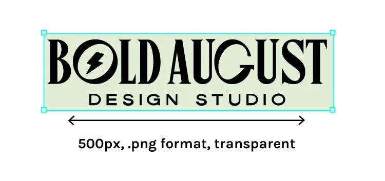
First, you need your logo file handy! It’s recommend your logo is a transparent PNG and not too large in file size. I’d recommend 500px wide so that it looks good at any size.
Logos: 500px wide, PNG format, transparent
Adding the Logo in Edit Mode
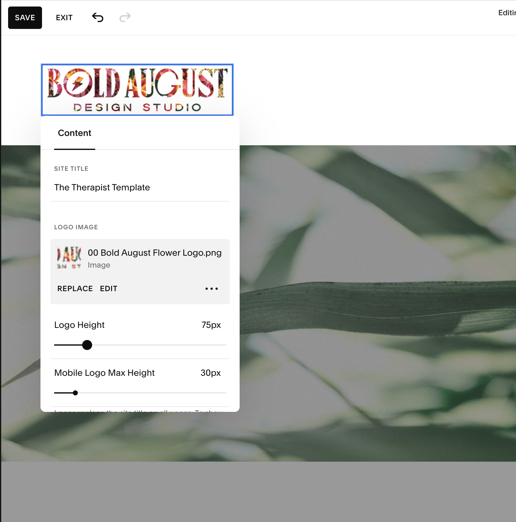
Click “edit” and then “Edit Site Header”
First, click “edit” in the top left corner. To add a logo, you’ll head to the heading of your Squarespace website. (Haha, head to the heading!) Click “Edit Site Header.”
Then, you click on the site title and click on the pencil icon. You’ll get a pop-up modal where you can add in your logo file! See above for logo sizing instructions.
You’ll see that there’s also a mobile option because you can add a different logo for your mobile site if you want and have a different file. This is great if you have an icon logo or stacked logo that would look better vertical. More on that further down the blog.
Make the Logo Bigger: Yay or nay for your Squarespace website?
Look, we all want huge logos. I get it - you want your logo to be loud and proud because it’s the literal name of your business. But hear me out: you’ve got to get people to learn about the what and why of what you do, which is arguably more important than just your logo. Your logo is good enough as a visual of your vibe and aesthetic, but on a website, users need to know more.
Think about it: my company name is Bold August. Yes, there’s the small “design studio” underneath - but what KIND of design? Interior design? Website design? Architecture? I need so much more than my logo to communicate what my website does. Your website content is crucial so you don’t want to overshadow it with a giant logo.
The before and after of a huge logo
Notice how, when the logo is larger, it pushes the content down.
This might look subtle, but it’s a huge difference when it comes to the user experience and usage of your website. First, the balance feels off. The logo is the same size as the H1 mission statement (the first big sentence on the page) and so it’s taking over the entire page and has real main character energy. But don’t I want my logo to be the main character, Olivia? I know you’re asking me. Actually, we don’t! You want your value and mission to be #1 on the page
Plus, you’ll see that the content starts lower on the page, so your user’s eye isn’t as focused on the content and they instead see your logo. We really want users to see the content first because then they can learn about how you are going to help them or provide for them specifically.
Overall, I’d suggest prioritizing your content rather than making the logo as big as possible. use your logo in other ways, and use your brand with strength rather than prioritizing the singular mark.
How big should my logo be on my Squarespace website?
I can’t give you an actual dimension because everyone’s logos are different proportions.
My logo is horizontal, so my logo at 100 pixels wide would be tiny. If your logo is vertical, your logo is going to look huge at 100 pixels wide.
Here’s a chart that explains this:
Notice how proportions of logos changes a lot!
This is why you’ll want to work with a professional brand designer who should provide you an entire logo system vs just a singular logo. You need a tall logo, a wide logo, a badge-based logo, a logo that works as a sticker, a logo that works in white, etc. This is a huge difference between a logo and a full brand!
Your Logo Should Prioritize Readability of All Text Within the Logo
Your logo should be big enough for the entire text of your logo to be readable but not so big that it overwhelms the site. Truly, this is where a seasoned web designer comes in, because I’m skilled at determining balance and proportion (and I have a degree in design!) but you need to use your best guess.
But notice how in these two examples, the logo has sub-text that isn’t readable at a small size:
In this case, the subtext is extremely important, because this company only does wedding florals. You want to make sure that subtext is readable for your entire audience. A great way to have a horizontal logo for a website is to place the icon on the left so that it fits in the space of a website better:
The best thing to do is ask a designer first, and if you don’t have a designer, research other logos that are comparable to yours.
Still not really sure how big your logo should be? Do a bit of competitor research! Check out logo sizes on websites in your industry, or from some of your favorite brands.
You can check logos with a list like:
Can I read all the text on the logo?
Does the logo feel like it’s in my face?
Does the logo feel like it’s way too small?
Is the logo causing weird spacing in this navigation?
Do I like the logo?
Examples of various logo sizes from Bold August:

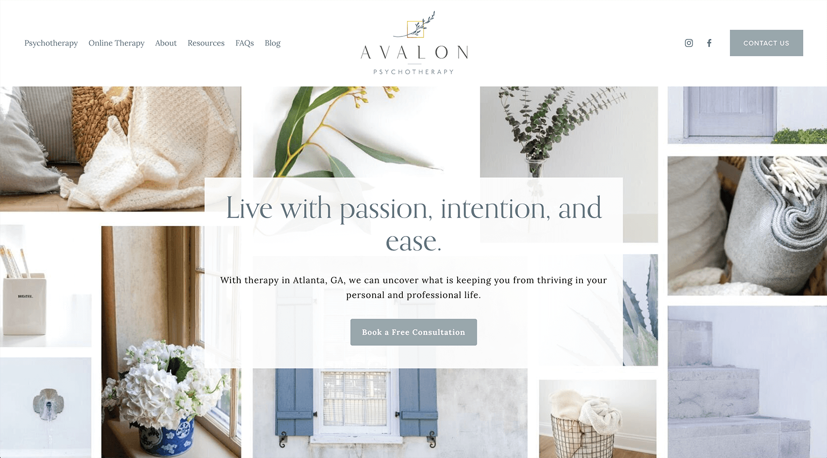

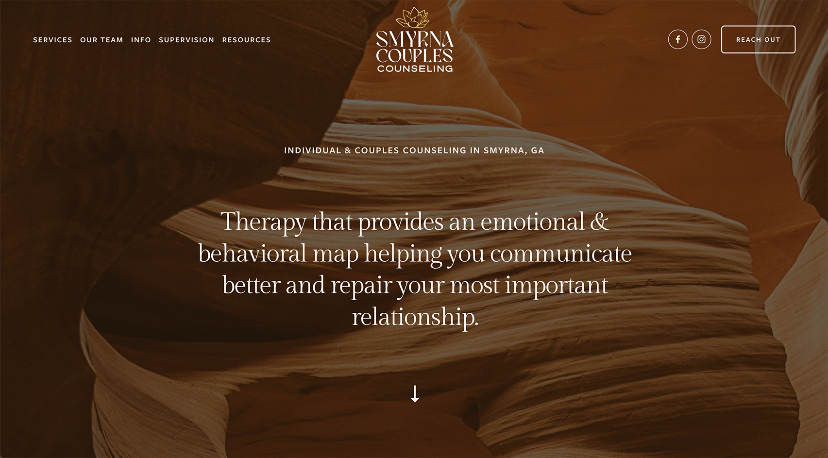
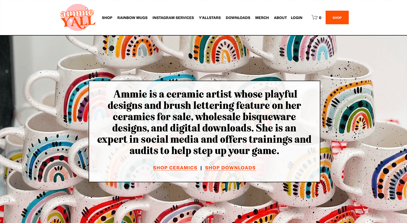
Notice how all of these logos have different headers and navigation styles to best match the brand, and notice how they’re not all GIANT logos. The brands speak for the company! Remember, a logo is just a mark, it’s not the end all be all.
Essentially, your logo is important but doesn’t need to be giant. When adding your PNG file (and it’s totally transparent, right?) to your Squarespace website, you want to be cognizant of balance and proportion. And you also want to work on your value statement just as much.
Ready for a logo designer to help you design the perfect sized logo for your website?
Hello, World!


