5 Ways to Use Canva to Make Website Graphics for Your Squarespace Site
You’ve heard about Canva, and you’ve maybe made an account and poked around, but you perhaps haven’t realized its full potential yet as a graphics creator. Canva is essentially a design program for non-designers. Despite owning and operating a design studio, I LOVE Canva because it reaches my main goal: empowering my clients to take the reins on their website!
What capabilities does Canva have for web graphics, however, especially when it comes to your Squarespace site? You know how to upload images to your Squarespace, but you maybe haven’t realized that there are easy ways to take those images to the next level with Canva.
Why should I care about making my site graphics with canva?
If you care about branding, and making your site look cohesive, adding some simple touches to your site is a great way to make your website look extremely custom. When images break boundaries, have different types of shapes, or don’t have straight corners, users know that you went the extra mile in editing. The work is obvious. And, someone who puts a lot of work into their website is someone that elicits trust from their users and clients.
We know that graphics help boost your website and branding. But how on earth do you go from boring images and portfolio items to creative, going-the-extra-mile frames and images? You use this article, of course!
In this post, we’ll cover 5 ways to enhance your site using Canva:
Making banner images
Using frames to enhance your images
Using mockups to show your work better
Making beautiful blogs
Building a brand library in Canva
1: Make your banner (hero graphic, full bleed image, etc) graphics in Canva
Are you tired of the same Unplash graphics everyone is using, and just want your own creative banner for your website? ME TOO! I use Canva to make my header graphics.
I use a 1750px by 1000px new document in Canva to make my banner images.
The only big caveat to these is that, on mobile, the graphic parts will be cut off, but that’s okay. You WANT things to be readable and easy for your mobile users.
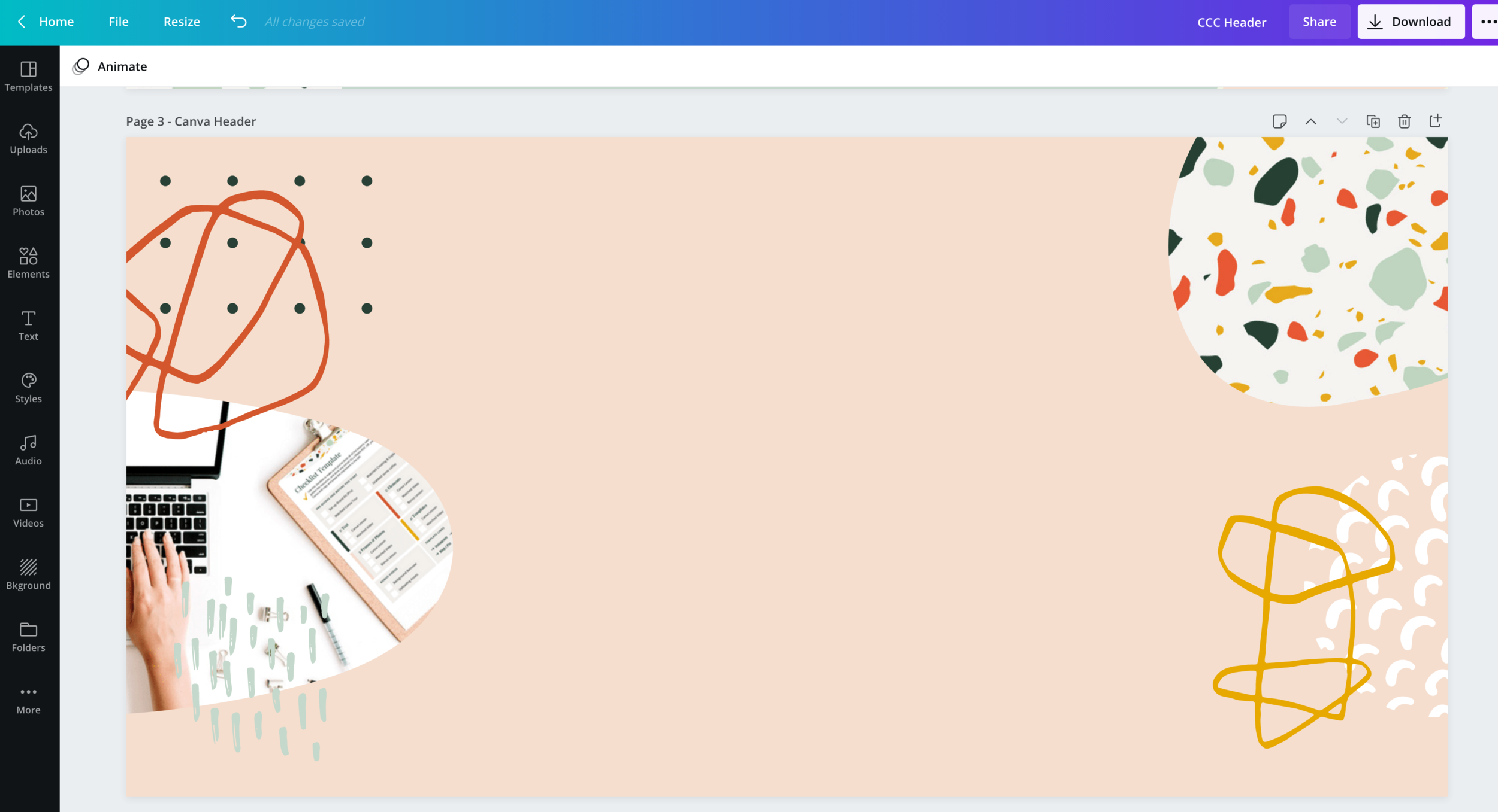
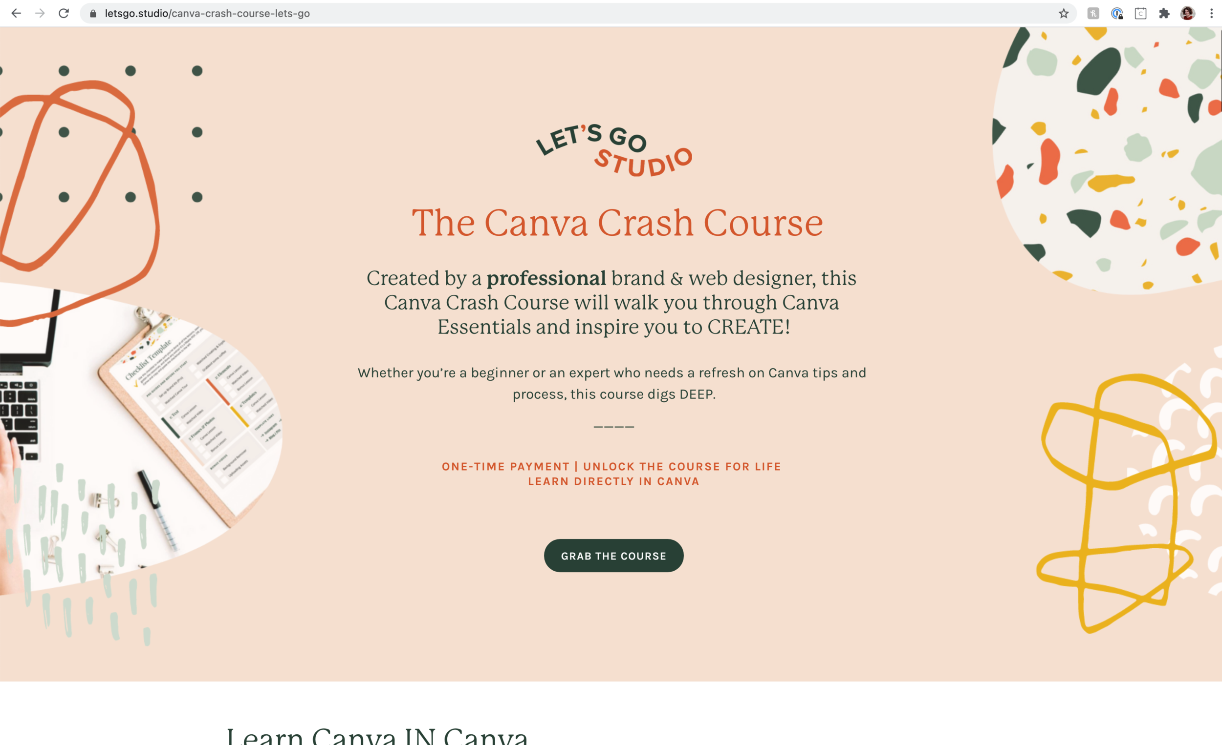
Check out here how I created this fun graphic, and how it looks on my Canva Crash Course page:
How it looks in Canva
How it looks on my site
If you don’t want to make some graphics, you also can use Canva’s giant library of images (which rivals Unsplash images) AND photo-edit them!
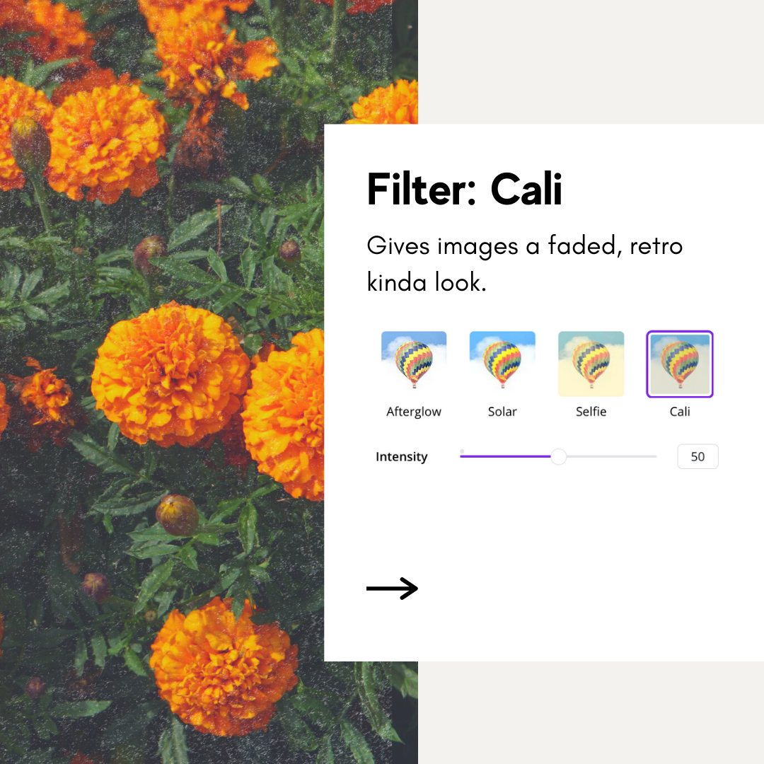
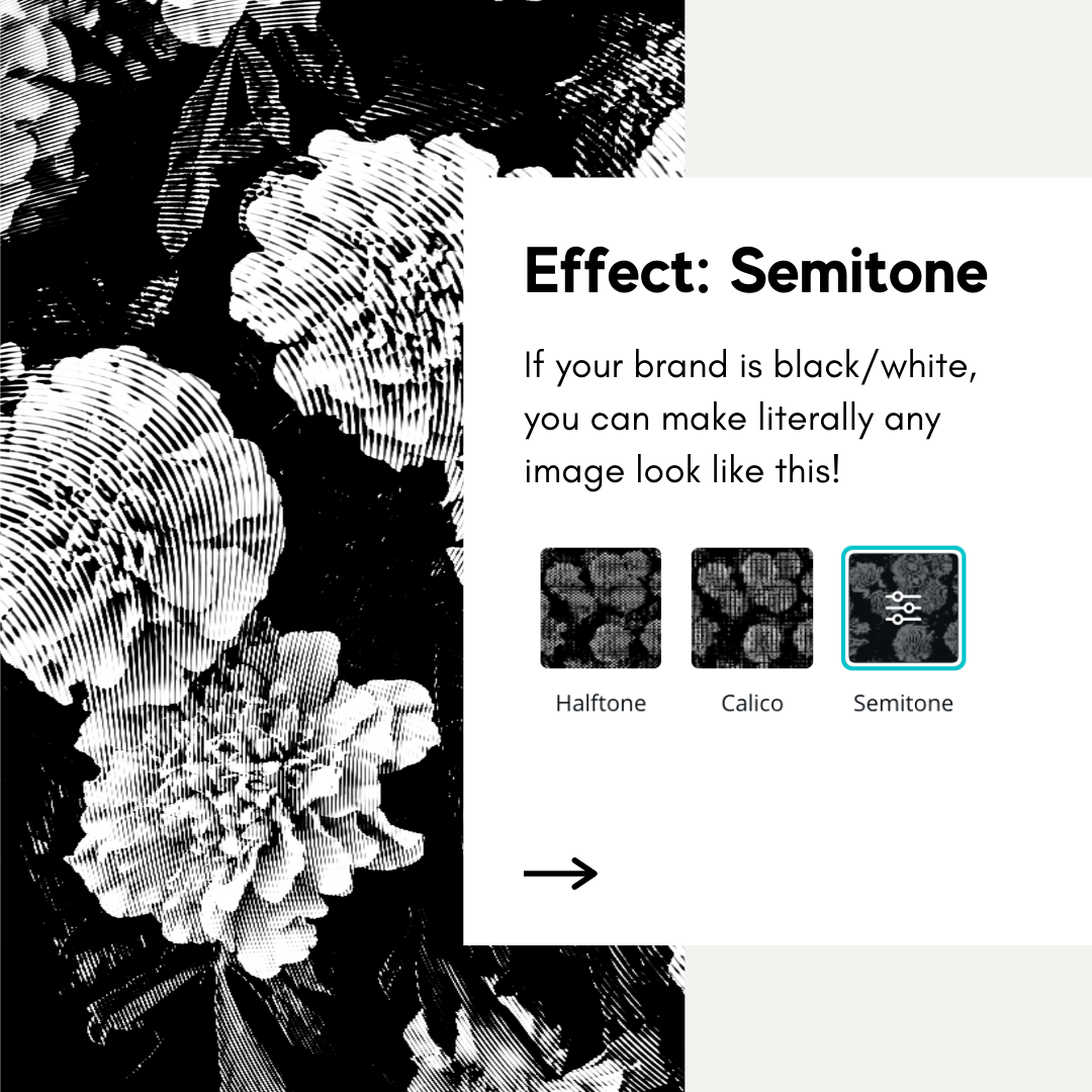
So, if you love a photo but want it black and white, or love a photo and want it to look a bit more retro, edit it in Canva first.
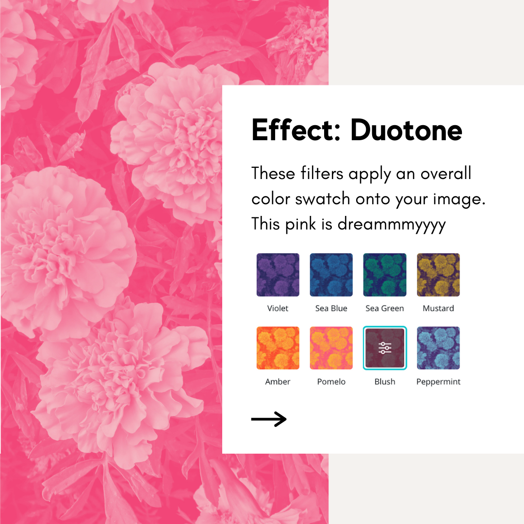
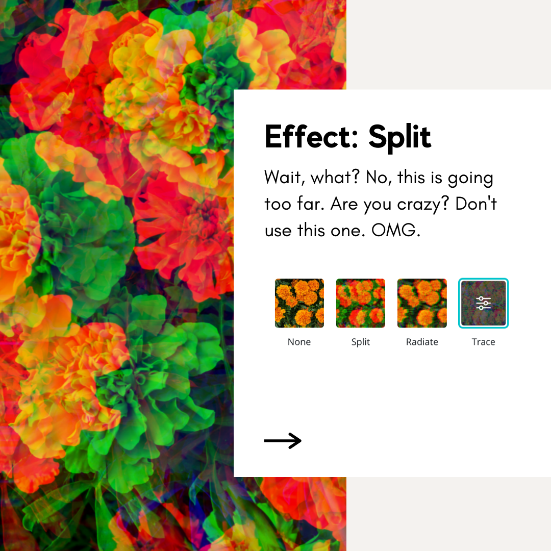
Here are some of my favorite image filters and effects:
Not loving photos OR graphics? Use a gradient! Type in “gradient” under elements, apply your colors, and add that to your Squarespace. It will look very custom, and no code needed!
Pssst…want to harness the power of Canva? Take my Canva Crash Course
Do you want to be a Canva master but can’t seem to figure it out? Take this course dedicated to walking you through amazing components in Canva, and your friends will start to wonder when you became a graphic designer!
Featuring 30+ templates, educational videos, checklists, and free lifetime updates, it’s a STEAL!
2: Put your images into circles, blobs, or other creative shapes.
Canva offers frames that allow you to place your images and have them display in creative ways. They offer a variety of common shapes and even a whole set of LETTERS! You can plop your images in a computer, a phone, a blob like the below, and a multitude of creative shapes. These shapes help to frame your images in a way that appears extremely custom to your users.
Go from a flat image to a fun shape, like the example below:
Before
After
Getting creative with your images is a great way to add some brand personality to your website. You don’t have to use the blob shape above but instead use circles, rounded corners, or other shapes that match your branding.
You do have to use Canva’s preset frames, but they offer a huge selection.
Canva Frames
You’re looking for these in Canva - a set of objects that have this landscape design in them! These are objects that images can be placed into, ranging from a simple circle to a computer to even a book mockup.
How do I know which one to pick?
Simple is typically best when creating frames. Canva offers several crazy shapes, like that scalloped circle and a slanted rectangle, but be sure you’re keeping cohesion in the forefront of your mind. Don’t simply choose one of every frame just for the sake of being creative. It’s fun, but don’t go crazy!
Don’t forget you can add other shapes, patterns, and assets to these frame shapes to make creative image “lockups.” (A lockup is design lingo for a specific graphic that’s locked up with graphics and images.) If you’re using a free Canva account, you can look at filling your assets from Creative Market. If you’re using a pro Canva account, check out their large library of graphics and assets that you can use.
→ Download our free set of templates to get creative with your images
3: Use Canva to Mock Up Your Work
Say you’re a writer with portfolio pieces that are hard to display, or a therapist with a whole toolkit of PDF education, or even a coach who has testimonials and engaging case studies to show off. How do you show your work in a creative way so that it’s understood by the user what it is? You don’t simply want to toss up that PDF or have a text-only case study.
Use Canva to show your work in a creative way, using their library of free and paid assets. From clipboards, to desk backgrounds, to creative quote layouts, Canva can help boost your portfolio and show your work in a more visually appealing format.
Go from a standard PDF to a PDF that’s stylized:
Before - Flat PDF Screenshot
After - Mockup Design
In the example above, it’s clear that the graphic on the right offers more engagement and interest than simply showing a screenshot of the PDF. Canva offers so many different layouts (and a HUGE amount on the pro plan), that making beautiful mockups is completely achievable!
I achieved the graphic on the right simply by plopping my Brand Bingo PDF on a blank desk. Canva offers tons of ways to show your work like this, from clipboards, to computer screens, to mobile phones. Get creative!
Why should I mockup my work?
Well, look at the images above! Which PDF do you want to engage with more? We use our eyesight to make sense of the world. Oftentimes it’s easier to imagine a sheet when it appears as if it’s on a desk instead of a flat graphic. Another example is showing my work in a computer instead of just a flat screenshot, like on my portfolio page.
4: Make Custom Blog Covers
Okay, I know this one is a lot of work and I’m asking a lot of you. Not only am I asking you to blog (yes, you should be blogging, no matter what kind of business you are! You’re reading this one, aren’t you?) but I’m also asking for you to make COVERS for them, too??
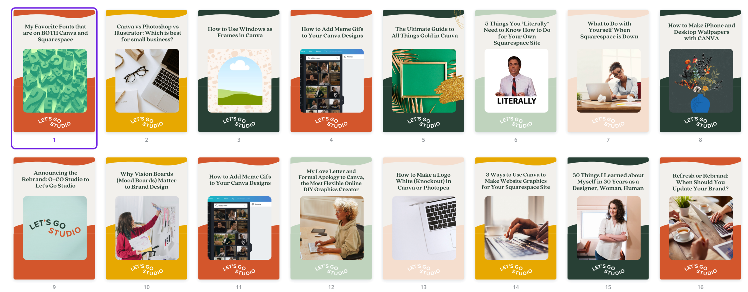
Yes, yes I am. And I think it’s worth it, because look how beautiful my blog thumbnails look:
Once you settle on your template, it only takes SECONDS to fill it in with your content and then to upload it to Squarespace.
You upload these in the “Options” tab on your Squarespace blogs.
Don’t know how to make a blog template? Canva has SEVERAL amazing templates for your use (and I always recommend starting with a template), but you can also take my Canva Crash Course for some amazing pre-made templates!
5: Use Canva as a Resource Library / File Storage for Building Brand Materials
Did you know that Canva is a massive resources for fonts, images, and elements? We’re in love with Canva Pro for this reason. (The Free account gives you a lot of assets, too, but the Pro Account cannot be understated.)
Build a library on Canva
To utilize this, you’ll have to know essentially what your brand uses. This is a part of your brand system. If you don’t know your brand style yet, reach out – we’d love to talk to you about expanding your brand! If you do know, then you can use Canva to build a style guide.
Check out how I made a recent blog post - I already had all of those cute assets stored in Canva, so it was easy to mix & match them!
Here are a few ways to use Canva as a brand library:
If using Canva Pro, be sure to add your colors and fonts to the brand kit, so you can use them across the site!
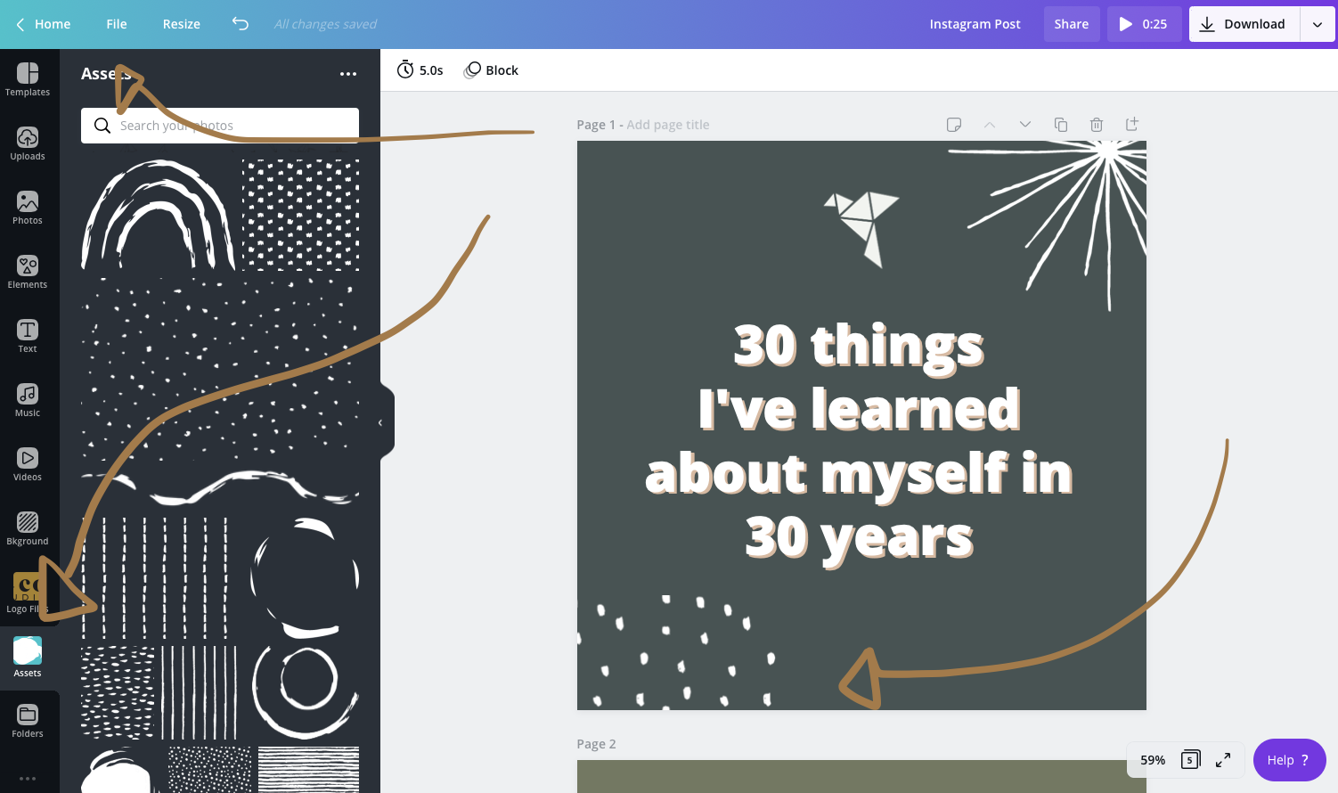
Upload all of your logo files, logo assets, icons, and all versions of your brand onto Canva for continuous use.
You can find assets on Creative Market and simply upload them to a folder within Canva, so you can always have them, and anyone on your team can see them!
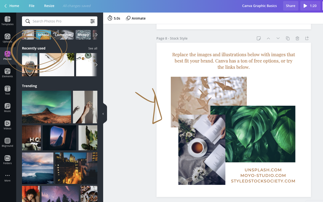
Make a new Canva design (doesn’t matter what size) and start adding images that capture your brand. Then, you’ll be able to see those in your “recents” folder.
When you place images into a design, Canva puts them in a “recently used” folder for you!
change colors of canva’s graphics to match your brand system
Did you know that Canva offers a whole suite of assets that they call “Elements”? Elements are different from images in that they’re editable. Oh yes. EDITABLE! Meaning you can change their colors to match your brand. This is huge news, because it means that you, too, can have fun botanicals, illustrations, fun typography, and more. You’ll simply find an element you like, place it onto your board, select it, and you’ll see the colors panel pop up.
Before - the element’s original colors
After - when selecting, I can change all colors to my own brand colors!
So, there you have it! These are three ways to put your best foot forward when editing your site’s graphics, on Squarespace and beyond. Canva is truly a marvel of a platform, and I can’t believe I haven’t embraced it sooner. Just because I’m able to use “fancier” design programs doesn’t mean I should, especially when there’s an online solution that can safely house my brand.
Comment below with other resources and tips for Canva!


