Custom Flatlay Photography: Investing in Your Brand’s Unique Style
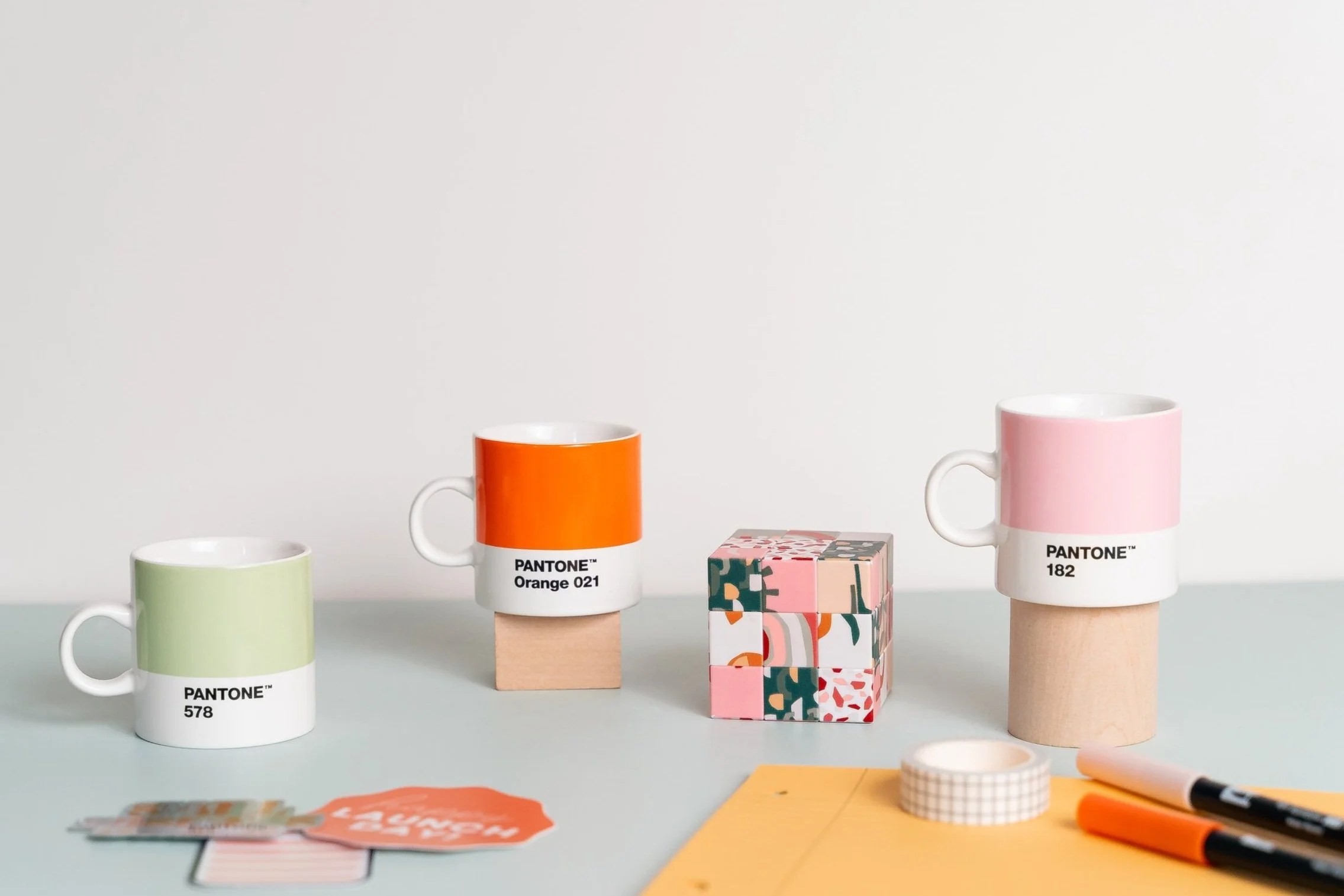
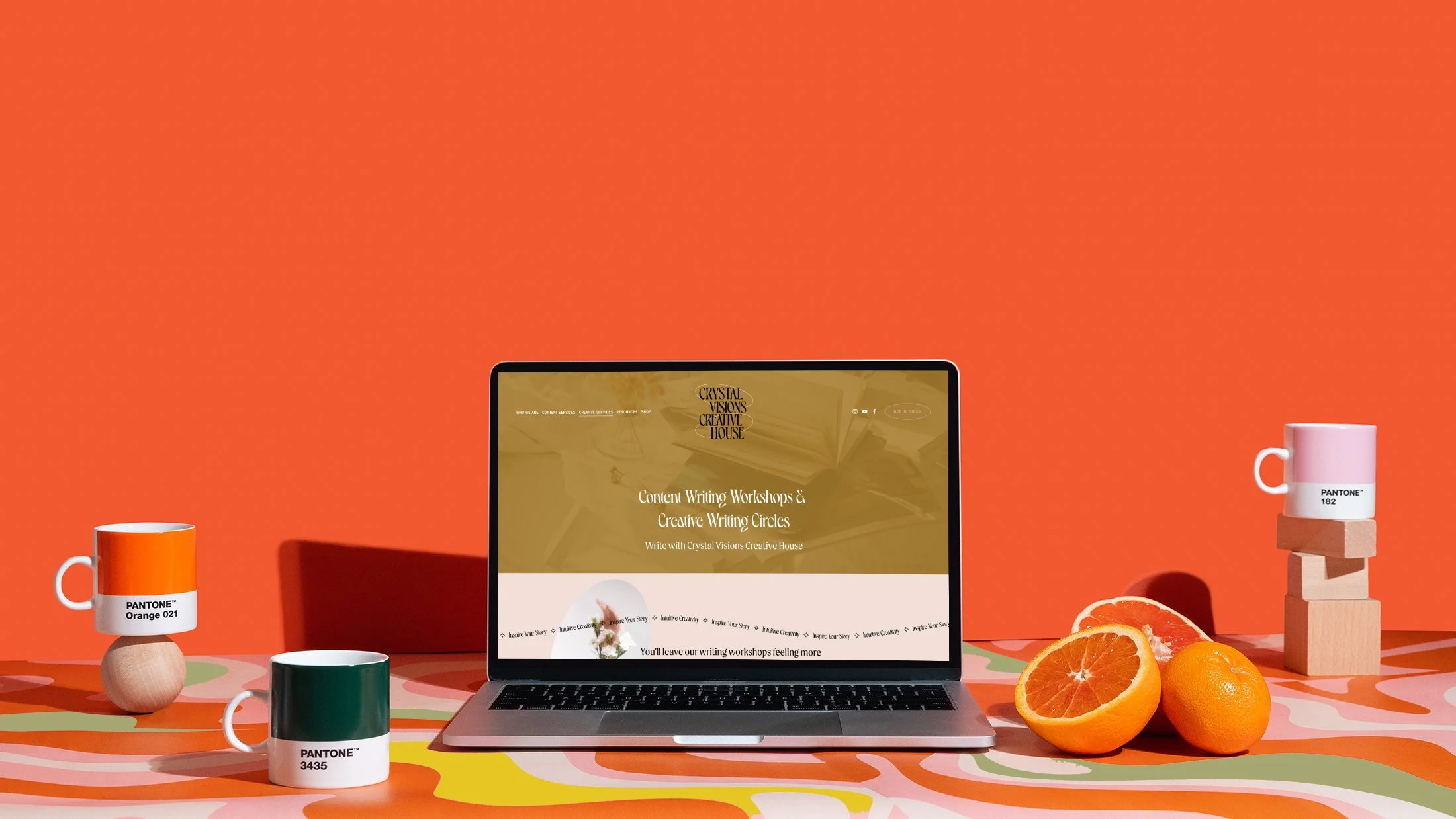
Recently, I invested in Mushaboom Studio’s flatlay photography package. Man, what a good decision for 2020! If you’re not sure, flatlays are those desk shots that you see across stock photography sites. I use them a ton within Bold August Design Studio to showcase my brands, worksheets, and websites. They help to frame your content in a way that feels tangible to your users. Sometimes just a screenshot doesn’t come across as “real” as a custom template photo.
The problem is, we’re all using the same stock sites, so the internet is starting to see the same shots over and over. And, my brand uses a very specific set of colors and icons.
I didn’t want to spend hours constantly photoshopping a set of images to use across my instagram and site, so investing in a custom photo shoot was just the ticket!
Here are a few worksheet shots (click to view larger):
No, these aren’t stock photos. They were shot custom in Atlanta, GA by Mushaboom Studio!
Why should you invest in custom photography?
I know I know, why would you pay when there are tons of free stock photography out there! The sources are endless for good stock. You’ve got Unsplash of course, which is the industry giant when it comes to free stock. And then, there are several subscription based stock models that offer more focused imagery and even some templates. (Our favorite is Moyo Studio, which offers a great quarterly price and beautiful images.)
The problem is, everyone can use those photos. Unsplash is great but we’re starting to see the same images over and over, because they are free to use for anything. Even some of the paid options have overlapping images, because once you buy that image, they don’t take it down. Anyone else can also buy it.
If you want to have a truly custom look and branding on your website, investing in a set of flatlays like this can help make your brand unique and stand apart from the crowd.
How do I know how to style my photography?
You don’t have to! That’s where a good photographer comes in! When working with Mushaboom Studio, I relied on their expertise to guide me in the process. They have a set of products in mind and we also hop on an intro call to talk about the brand. Of course, it helps to have:
Your brand color palette
A vision board of items that you like to show the photographer
Know what items you are promoting (courses, downloads, etc)
Think about what items complement your brand, like notebooks, printed items, office supplies, etc
Think about what visuals complement your brand. Now is a great time to work on an icon, a pattern you love, or think about what books feel like they’re “you.”
How do I use my flatlay photography?
It’s best if you comb through your website to determine what pages could use photography, and if they already have photography, which pages could have that photography replaced with custom flatlays.
During my process, I knew I needed flatlays for my homepage, all of my courses, my instagram, my blogging content, and some to pocket for future use. I made a spreadsheet of where I needed to use all of these photos and made sure they were communicated to the photographer.
I use my flatlay photography for:
Full bleed images across my site
Cropped and formatted posts for social media
Complementary blog images
Feature course images
In conclusion, anything that feels specific and custom toward your brand will paint a more cohesive picture of your business. Users love a custom experience when browsing your materials, so using things that feel original and on-target will enhance your brand!


